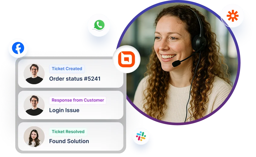
Accessibility Support Built for Better Digital Experiences
Make your product easier to use for more people with support designed around WCAG 2.2 guidance, screen reader compatibility, WAI‑ARIA semantics, and high‑contrast theme support. These areas help users move through pages, understand actions, and complete tasks with clarity and confidence.
Accessibility helps more people use your product with less effort. It improves navigation, clarity, and confidence—especially for users who rely on assistive technologies.
Wider Reach more users—including the 1 in 6 people worldwide who experience significant disability.
Legal Compliance Build on accessibility practices that support regulatory and procurement expectations.
Better UX for All Accessibility improvements often make experiences smoother for every user.
Deep dive
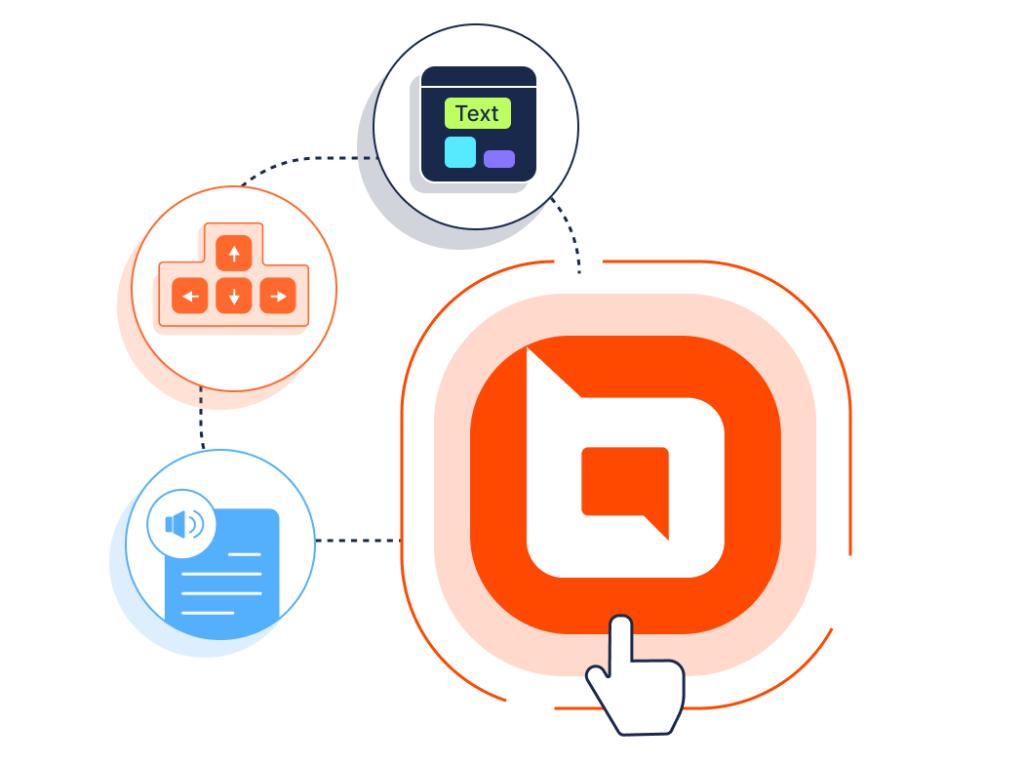
Four Pillars of Accessible Design
These four areas help create a clearer, more usable experience for people using assistive technologies or visual accessibility settings.
WCAG 2.2
WCAG 2.2 is the W3C’s global standard for accessible web content. It defines testable criteria and Level A requirements, guiding teams to design and evaluate inclusive digital experiences.
Keyboard Navigation
Keyboard navigation allows users to move through a page without a mouse. This supports interaction with links, buttons, menus, and forms using keyboard keys alone. WCAG includes keyboard accessibility as a key part of creating operable experiences.
Screen Reader Compatibility
Screen reader compatibility helps digital content work clearly with screen-reading tools so users can understand content, controls, and interface updates. WCAG is designed to improve access across disabilities—including blindness and low vision—using requirements that help assistive technologies interpret content and behavior.
WAI‑ARIA
WAI‑ARIA provides roles, states, and properties that help assistive technologies understand widgets, structure, and behavior—especially in dynamic interfaces and custom components. It improves accessibility and interoperability of web applications by exposing meaningful semantics to assistive technologies.
Dark Theme Support
High-contrast themes improve legibility by using stronger foreground/background separation—often with dark backgrounds and light text—making interfaces easier to use for people with low vision and color-vision deficiencies. WCAG includes success criteria focused on contrast and distinguishability to improve readability and usability.
Customer Testimonials
Don't Take Our Word for It
Here are a few kind words from some of our happy customers.


